“A fair world begins with a fair map.”
Robert Dussey, Foreign Minister of Togo, speaking ahead of the United Nations vote
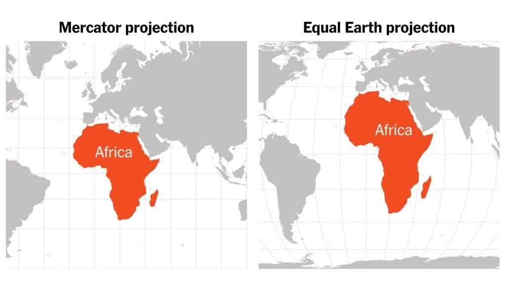
For generations, schoolchildren everywhere have grown up with the same map of the world: Africa sitting under Europe, large but somehow not that large; Greenland stretched to look enormous; and North America and Russia dominating the northern half of the page. I think the image is familiar to everyone. It is not accurate.
On 4 September 2026, the United Nations General Assembly moved to fix this problem by adopting an African-led resolution, brought by Togo on behalf of the African Group and backed by the African Union, that encourages equal-area map projections, chiefly Equal Earth, as a truer representation of the world's landmasses. The vote passed 164 to one, with six abstentions. The United States cast the sole vote against, calling the measure an ideological distraction. For The African Renaissance Review, this is more than a story about cartography. It is a story about how Africa has been seen, how Africa has been represented, and how Africa sees itself.
A continent that was never as small as the map suggested
Africa is not a small continent. It covers roughly 30.37 million square kilometres (land mass size, about 20% of the Earth’s surface area). It is large enough, as the African Union has illustrated, to hold the United States, China, India, Japan and several major European countries within its borders. The starkest comparison is Greenland, which the Mercator projection renders as roughly comparable in size to Africa. In reality, Africa is about fourteen times larger. That is not a minor cartographic accident. It is a profound gap between what the eye has been taught to see and what geography actually shows, and no map can change a continent's physical size. The problem has always been representation, and representation matters.
What is wrong with the Mercator map?
Perhaps, one may ask: What is wrong with the Mercator Map? Well, the Mercator projection, devised by the Flemish cartographer Gerardus Mercator in 1569, was built for navigation: it let sailors plot constant compass bearings as straight lines, a genuine technical achievement for its purpose. The trouble begins when it is used to communicate relative land area. Because the Earth is spherical, no flat map can represent it without some distortion, and Mercator's particular compromise inflates territory farther from the equator by enlarging Greenland and other high-latitude regions while compressing Africa and other equatorial ones. The African Union now argues explicitly that Mercator miscalculated Africa's true size. Mercator is not a “wrong” map in every sense; it is a map built for a specific job. The mistake has been treating a navigation tool as an objective picture of the world's relative scale.
The Equal Earth alternative
Equal Earth, introduced in 2018, is an equal-area projection designed to preserve land-mass proportions more faithfully than Mercator. It does not eliminate every distortion, since no flat rendering of a sphere can do that, but it reframes the question from “what best serves navigation” to “what gives the public a truer sense of relative scale.” On that measure, Africa looks like Africa again.
It would also be inaccurate to claim Mercator set out to diminish Africa; his projection answered the demands of maritime navigation at that particular time, not a colonial agenda, and the contemporary discussion should resist flattening that history into simple propaganda. In the same vein, it would be equally naive to treat representations as politically neutral simply because their creators did not foresee every later consequence. The Guardian Newspaper's coverage of the African Union's campaign made this argument well: maps helped normalise particular worldviews during the colonial era, and defaulting to one projection for generations can quietly perpetuate those inherited assumptions. The real question was never whether Mercator intended harm. It is what happens when generation after generation encounters a picture in which Africa looks dramatically smaller than it actually is: a legitimate question about education, perception and intellectual formation.
The politics of seeing
Every civilisation develops ways of seeing the world, and maps are among the most powerful of them simply because they tell us where the centre is, what counts as large or small, and what feels close or distant. Global cartographic convention took shape largely within a world reordered by European maritime power, exploration, commerce and empire. That is not because Europeans invented geography; it is because European institutions became disproportionately influential in deciding which representations became the global default. A sixteenth-century navigation tool went on to become one of the dominant visual pictures of the entire planet, and that inheritance deserves examination. The African Union describes correcting these distortions as part of restoring Africa's “true place in the global imagination,” a phrase worth sitting with, because this discussion is ultimately about imagination.
If Africa is large, why does it so often appear small?
The physical size of Africa is only one part of the story. Africa comprises 55 states, some of the world's largest reserves of critical minerals, vast agricultural potential, major freshwater systems (9.3% of the world's total renewable freshwater), extraordinary ecological diversity, fast-growing cities, a predominantly youthful population, some of humanity's oldest civilisations, and genuine centres of scientific and intellectual innovation. Yet international coverage in most western media still reaches first for poverty, conflict, disease, aid, instability and migration, and the continent's scale and complexity keep disappearing under such narratives. The map controversy becomes a useful metaphor for a larger pattern: what happens when both the physical and the intellectual representation of a continent fall short of reality?
There is an important principle here for African intellectual life. Africa does not need flattering distortion, exaggerated maps, or mythology dressed up as history. What it needs is accuracy. Equal Earth does not make Africa larger than it is; it represents Africa closer to the size it has always been. That distinction is the whole point. A renaissance cannot be built on falsehood. It has to be built on reality.
From correcting maps to correcting knowledge
The more interesting implication lies beyond cartography. If Africans are correcting the map, what else deserves correction? Who writes African history, and who compiles the continent's economic statistics? Who owns the databases holding African information, and who controls African intellectual property? Who designs the algorithms that increasingly show Africa to the world, and who decides which African thinkers gain global recognition, and what counts as reliable information about Africa? These questions are much bigger than any single map. In our view, the map is simply the clearest example of these issues.
The intellectual sovereignty question
Africa's rebirth must involve intellectual efforts, not just cultural restoration. Being intellectually independent does not mean ignoring information from other parts of the world; true intellectual confidence means being able to interact with knowledge from any source. However, interacting with ideas is not the same as relying on them. Africa needs to create its own knowledge, confirm its validity, and share it with the world's shared intellectual resources. This involves making universities stronger, putting money into scientific study, developing statistical capabilities, protecting historical records, building digital infrastructure, and producing academic work strong enough to pass international review. This approach allows African viewpoints to help shape global discussions, rather than simply being included in them.
The classroom may be where it begins
The UN resolution has no legal force. It does not forbid the Mercator projection; Reuters reports it specifically permits the Mercator projection for sea and air travel, where its features continue to be practical. The main area of focus is schooling and how things are shown to the public. Togo has announced plans to change its school geography materials by the close of 2026 and hopes other governments, schools, international groups and technology companies will do the same. The African Union is encouraging educational bodies, publishers and digital platforms to make the same switch. This is important because most people's first mental image of the world forms in the classroom. A child who sees Africa accurately depicted learns a simple idea: that Africa is large, and perhaps a deeper lesson: that Africa should be central to the world's geographical view because it is, objectively, one of the world's major landmasses.
The digital map is the next frontier
The debate will not end with textbooks, because today's map lives on phones, websites, navigation systems, social platforms and artificial intelligence (AI) systems, which means the companies that decide how geographic information is displayed still hold real influence over public perception. The Guardian Newspaper reported that Togo plans to have discussions with the African Union, UNESCO and technology companies, including Google Maps, on implementing this realistic change. But this raises a sharper question still: who controls the digital representation of Africa?
Maps are essential data. Information about population, minerals and the economy is also data. Artificial intelligence (AI) is trained on data. So if African sovereignty is to mean anything in this century, it has to extend beyond land to information about that territory.
The symbolism matters
Some critics will say changing a map is merely symbolic, and in a way, they are partly correct. A new map projection will not suddenly build a factory, electrify a village, reform a university, or even put an end to corruption. But symbols are not insignificant simply because they are symbols; they help shape culture, culture shapes our assumptions, assumptions shape our institutions, and institutions shape human behaviour. The Guardian Newspapers made a similar argument: something that seems symbolic can still change perception, and this change in perception can then influence political and economic decisions. The map is important exactly because it is such an ordinary thing. It has hung on classroom walls, and even in some offices, for generations without most people questioning what it represents.
A new way of seeing
ARR's founding proposition – Ideas. Evidence. Wisdom. Africa. — captures what this debate demands. Ideas, because it forces a look at inherited colonial assumptions. Evidence, because the argument rests on measurable geography, not sentiment. Wisdom, because correcting one distortion should not lead into another. And Africa, because the whole episode raises a fundamental question about how the continent understands and represents itself to the global village. Africa does not need to reject the world; it needs to engage it from a position of greater intellectual confidence, which means knowing the difference between criticism and insecurity, between pride and propaganda, and between inherited convention and objective reality.
Again, an interesting irony emerges: this new map is not actually showing a new Africa. The continent was always around 30.37 million square kilometres; what really changed was that the international community finally seemed willing to accept a depiction that properly reflected that size. The United Nations did not make Africa bigger. What it did was assist in getting the image right. Reality does not need to be made larger to be important. Sometimes, it just needs to be viewed precisely.
So, the idea is to correct the map, and also to correct how we imagine things.
Africa's cartographic correction should not turn into something focused on past grievances. Instead, it should be about intellectual maturity. The lesson we can take from this is not that everything connected to Europe is wrong or false; rather, it is that systems we have inherited should be analysed thoroughly, not just accepted without question. The Mercator projection, for example, is still helpful for navigation. But for showing relative land areas, Equal Earth is more useful. Different types of maps serve different purposes, and the mature way to approach this is not to get rid of the old map but to understand it, and then pick the map that fits the truth you want to convey.
That is where the African Renaissance begins: not with exaggeration, not with resentment, not with mythology, but with the courage to see things as they truly are. For centuries, Africa has been represented through maps, stories and institutions built largely in other parts of the world. The moment has come for Africans to participate fully in determining how Africa is represented, understood and studied. The continent does not need to be made larger. It needs to be seen at its actual scale.
Africa was never small. The map was.
ARR EDITORIAL NOTE
The African Renaissance Review considers the UN's 2026 “Correct the Map” resolution an important contribution to the broader conversation about knowledge, representation and African agency. ARR supports rigorous, evidence-based examination of inherited assumptions while recognising that cartographic projections serve different legitimate purposes. The Equal Earth projection improves the representation of relative land area; it does not eliminate every form of geographical distortion. Consistent with ARR's editorial standard, the resolution's outcome and central factual claims below have been cross-checked against multiple independent reports at the time of publication.